
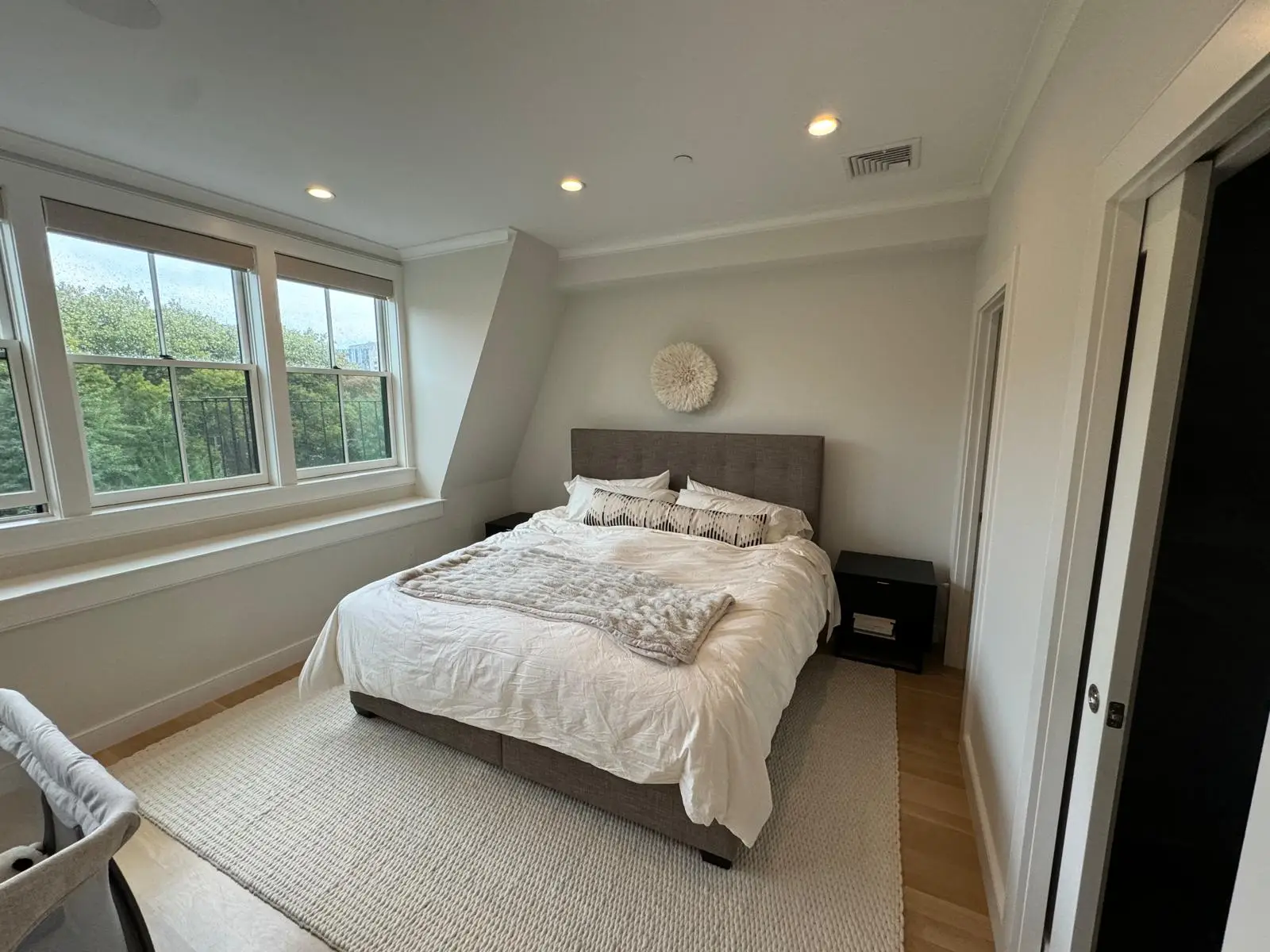
Your bedroom is more than just a place to sleep; it’s your personal sanctuary, a space for relaxation, rejuvenation, and quiet reflection. The colors you choose for this intimate space can significantly impact your mood, sleep quality, and overall sense of well-being. From serene neutrals to vibrant accents, selecting the right paint color for your bedroom walls involves considering current trends, the room’s unique characteristics, and your personal style. A well-chosen palette can transform a simple room into a calm, stylish retreat that truly feels like your own.
Trending bedroom shades: Neutrals, sage, soft blue & pastels
While personal preference should always guide your decision, staying aware of current trends can offer inspiration and help you create a modern, appealing bedroom environment. Today’s popular choices lean towards colors that promote tranquility and a connection to nature.
- Warm Neutrals: These remain timeless favorites due to their versatility and ability to create a soothing backdrop.
- Off-Whites & Creams: Think Swiss Coffee, Sherwin-Williams Alabaster, or Benjamin Moore White Dove. They offer a clean, expansive feel without the starkness of pure white, allowing other decor elements to shine.
- Warm Grays & Greiges (Gray + Beige): Benjamin Moore Revere Pewter and Sherwin-Williams Agreeable Gray are classic examples. These colors provide a sophisticated, subtle warmth that pairs beautifully with various wood tones and textures. They are incredibly adaptable and rarely feel cold.
- Serene Sage Greens: Sage has surged in popularity for bedrooms, offering a calming, earthy vibe.
- Why it works: It connects the indoors with nature, promoting a sense of peace and growth. It’s subtle enough to act as a neutral but adds more character than a typical beige or gray.
- Shades to consider: Look for muted, desaturated sage tones that lean slightly gray or blue rather than overtly vibrant greens.
- Soft Blues: A perennial favorite for bedrooms, soft blues are inherently calming and associated with tranquility and rest.
- Why it works: Blue has been scientifically shown to lower heart rate and blood pressure, making it ideal for a sleep space.
- Shades to consider: Avoid bright or highly saturated blues. Opt for muted sky blues, dusty blues, or blues with a hint of gray, like Benjamin Moore Palladian Blue or Sherwin-Williams Misty.
- Gentle Pastels: Beyond traditional baby room pastels, sophisticated muted pastels are making a strong comeback.
- Soft Pinks: Blush or dusty rose tones (Benjamin Moore First Light) can create a warm, inviting, and slightly romantic atmosphere without being overly feminine.
- Muted Lavenders & Violets: Very pale, almost grayed-out lavenders can be incredibly soothing and unique, offering a touch of understated luxury.
- Light Peach/Coral: A warm, inviting alternative that adds a subtle glow to the room, especially lovely in spaces lacking natural light.
Mood & light: Choosing colors based on natural light and room size
The same paint color can look drastically different in two different rooms due to varying light conditions and room dimensions. Understanding these factors is crucial for successful color selection.
- Natural Light Exposure:
- North-Facing Rooms: Tend to receive cool, indirect light throughout the day. To counteract this, choose warmer colors (yellows, reds, oranges, warm neutrals like greige) to make the room feel cozier and more inviting. Cool colors here can make the room feel stark or unwelcoming.
- South-Facing Rooms: Bathed in bright, warm light all day. These rooms can handle cooler tones (blues, greens, cool grays) without feeling cold. Warm colors might feel too intense or overwhelming here.
- East-Facing Rooms: Get bright morning light, which turns softer and cooler in the afternoon. They can work with a wide range of colors. Consider cooler shades to temper the morning brightness or warmer tones to brighten evenings.
- West-Facing Rooms: Receive warm, intense afternoon and evening light. Light, cool colors can balance the strong afternoon sun, or you can lean into the warmth with richer, deeper hues that glow in the evening light.
- Room Size:
- Small Rooms:
- Light Colors: Generally, lighter colors make a small room feel larger and more open by reflecting light and blurring the boundaries of the walls. Whites, off-whites, pale grays, and light pastels are excellent choices.
- Monochromatic Schemes: Using a lighter shade on the walls and a slightly lighter shade or white on the trim and ceiling can create a seamless look that expands the space.
- Large Rooms:
- Deeper Colors: Large rooms can comfortably handle darker, richer, and more saturated colors without feeling claustrophobic. Deep blues, emerald greens, charcoal grays, or even certain purples can create a dramatic, luxurious, and intimate atmosphere.
- Warm Tones: Warm, medium-to-dark tones can make a large, cavernous room feel cozier and more inviting, helping to “bring in” the walls.
- Consider Ceiling Height:
- To make a ceiling feel higher: Paint it a lighter color than the walls, or the same color as the walls but in a lighter tint.
- To make a ceiling feel lower (cozier): Paint it a darker color than the walls, or the same color as the walls, especially in a small bedroom.
- Small Rooms:
Designer favorites (e.g., swiss coffee, revere pewter, nantucket gray)
Certain paint colors achieve iconic status among interior designers for their versatility, beauty, and ability to enhance a space. These “designer favorites” are often chosen for their nuanced undertones and how they interact with light.
- Benjamin Moore Swiss Coffee (OC-45):
- Why it’s loved: This is a warm, creamy off-white that avoids feeling stark or cold. It has a very subtle yellow/beige undertone that prevents it from being boring and makes it incredibly versatile. It works well in almost any light condition, providing a soft, inviting backdrop.
- Best for: Creating a serene, ethereal, or minimalist bedroom. It pairs beautifully with natural wood tones, linens, and layers of texture.
- Benjamin Moore Revere Pewter (HC-172):
- Why it’s loved: Perhaps one of the most famous “greige” colors, Revere Pewter is a perfect balance of gray and beige. Its chameleon-like quality allows it to shift between warm gray and light beige depending on the light, making it exceptionally adaptable. It’s sophisticated and grounding.
- Best for: Adding subtle warmth and sophistication. It acts as a fantastic neutral backdrop for both modern and traditional decor, complementing a wide array of accent colors.
- Benjamin Moore Nantucket Gray (HC-111):
- Why it’s loved: Despite its name, Nantucket Gray is actually a muted green-gray that evokes a sense of calm and nature. It’s a fantastic alternative to traditional grays, offering more character and depth while still acting as a neutral. It has a historic, classic feel.
- Best for: Creating a tranquil, earthy, or coastal-inspired bedroom. It pairs well with natural materials, whites, and blues.
- Sherwin-Williams Sea Salt (SW 6204):
- Why it’s loved: A beautiful, chameleon-like color that can appear as a pale green, blue, or even gray depending on the light. It’s incredibly soothing and calming, making it a perfect choice for bedrooms.
- Best for: A spa-like, tranquil, or coastal bedroom vibe. It works well with white trim and natural textures.
- Farrow & Ball Elephant’s Breath (No. 229):
- Why it’s loved: A warm, contemporary gray with a hint of magenta that gives it a unique depth and warmth. It’s sophisticated and incredibly versatile, looking beautiful in both natural and artificial light.
- Best for: Creating a luxurious, sophisticated, and inviting bedroom. It pairs well with both warm and cool palettes.
Always remember to test large swatches of these colors in your own bedroom, observing them at different times of day, before committing to a choice.
Color techniques: Color draping, accent walls & ceiling pop
Beyond simply painting all four walls, various color techniques can add depth, interest, and a unique personality to your bedroom.
- Color Draping (or “Color Washing”):
- What it is: This technique involves extending the wall color onto the ceiling and/or trim, creating a continuous, enveloping feel. It can be done with one solid color or with slightly varying shades of the same hue.
- Why it works in bedrooms: It creates a cozy, immersive, and incredibly serene atmosphere. By blurring the lines between walls and ceiling, it can make a room feel larger and more boundless, especially if using a soft, muted color. It’s particularly effective with blues, greens, or warm neutrals.
- How to apply: Choose a single color for walls and ceiling, or a color for walls and a lighter tint of the same color for the ceiling. For trim, you can match the wall color or choose a slightly darker or lighter tone.
- Accent Walls:
- What it is: Painting one wall a different color or using wallpaper, paneling, or other textures to create a focal point.
- Why it works in bedrooms: It allows you to introduce a bolder color or pattern without overwhelming the entire space. It’s ideal for adding personality, highlighting architectural features, or drawing attention to the bed as the room’s centerpiece.
- Placement: Typically the wall behind the bed, but could also be a wall with a window or an interesting architectural detail.
- Color Choice: Choose a color that complements the main wall color and the overall decor. It can be a darker, more saturated version of the main color, a complementary shade, or a bold contrast.
- Ceiling Pop (or “Fifth Wall”):
- What it is: Treating the ceiling as the “fifth wall” by painting it a color other than standard white.
- Why it works in bedrooms: It adds an unexpected element of design and can dramatically change the feel of the room. A darker color can make a high ceiling feel cozier and more intimate, while a lighter, subtle color can add softness or an ethereal quality.
- Color Choice:
- Soothing Effect: Use a very pale, muted blue or green for a calming, sky-like effect.
- Cozy Effect: Paint the ceiling a darker, more saturated version of your wall color (or even the same color) to create a warm, enveloping “cocoon” feel, especially effective in small bedrooms.
- Subtle Interest: A pale neutral with a hint of warmth or coolness can add softness without being too bold.
Ready to transform your bedroom into the ultimate retreat? Mass Pro Painting brings expertise in interior painting, helping you select the perfect colors and execute flawless application for a beautiful and lasting finish. Contact us today for a consultation and let’s create the bedroom of your dreams!