
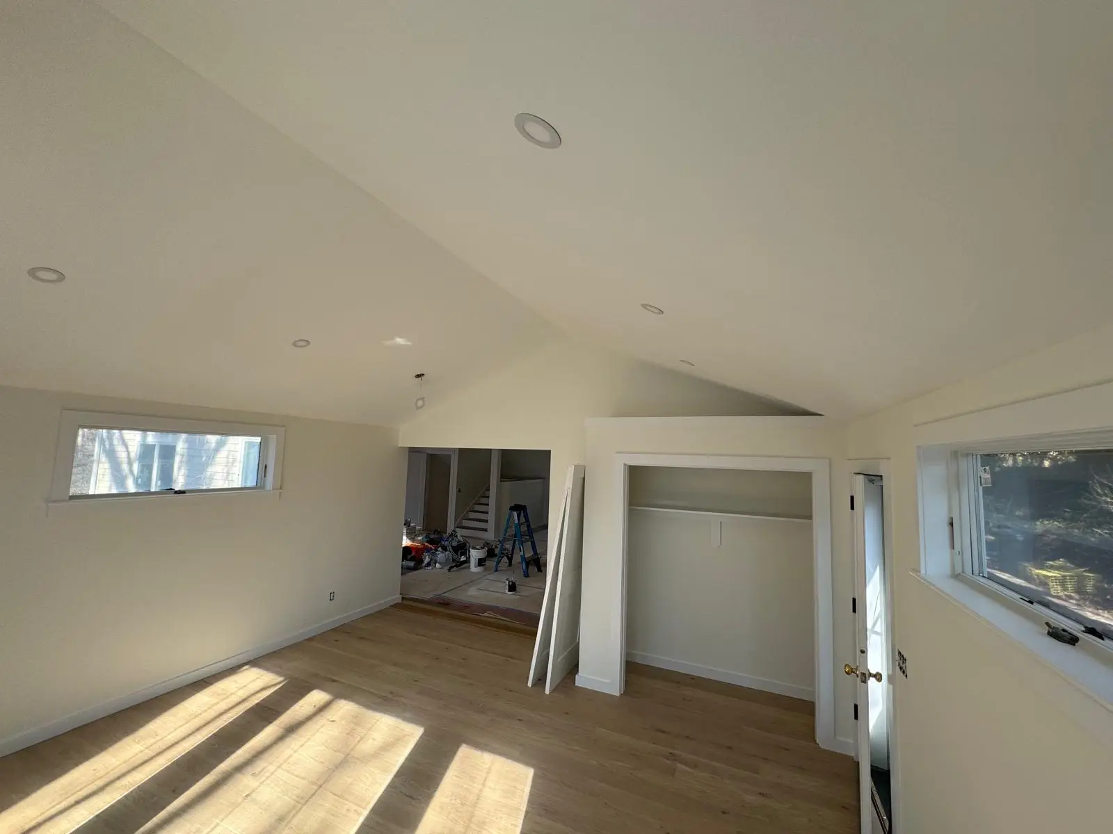
The ceiling is often referred to as the “fifth wall,” yet it is frequently overlooked or automatically painted standard white. However, the color and finish of your ceiling dramatically impact the perceived size, height, and overall mood of any room. Strategic ceiling color choices can transform your space, adding intimacy, brightness, or dramatic flair.
Mass Pro Painting offers expert guidance on optimizing ceiling color and finish to perfect your interior design vision.
Most Popular Ceiling Colors
While white remains the classic choice, modern design embraces a spectrum of hues to achieve different effects.
Classic White (Brightens Any Room)
A clean, bright white is the default for a reason. It maximizes light reflection, immediately making a room feel larger, taller, and airier. It works universally with any wall color and is the safest option for resale.
Warm White for Cozy Spaces
Instead of stark white, choosing a white with a touch of yellow, beige, or pink undertone adds warmth. This is perfect for creating cozy, intimate spaces like family rooms or bedrooms, preventing the room from feeling cold or sterile.
Light Gray for Modern Style
A very pale, sophisticated light gray offers a subtle, modern alternative to white. It adds a sophisticated layer of color without closing in the space, working particularly well in contemporary homes with cooler wall palettes.
Soft Blue for Calming Rooms
Soft, pale blue is an excellent choice for bedrooms or bathrooms. The color is inherently calming and restorative, mimicking the feeling of the sky. It can visually lift the ceiling, especially when paired with warm white walls.
How Ceiling Color Affects Room Perception
The relationship between wall and ceiling color is fundamental to spatial design.
Light Colors Make Ceilings Feel Higher
When the ceiling color is lighter than the walls, the eye is drawn upwards. Light, cool colors visually recede, creating an illusion of height and making a room feel more expansive. This technique is ideal for basements or rooms with lower-than-average ceiling heights.
Dark Tones Add Drama or Intimacy
Painting the ceiling a color darker than the walls (or a dark, saturated color) brings the ceiling visually down. This technique works well in large, cavernous rooms to add a sense of intimacy and drama, or in media rooms where you want to minimize visual distractions.
Matching Walls + Ceiling for “Color Drenching”
Painting the walls and the ceiling the exact same color—known as “color drenching”—can blur the boundaries of the room. This highly modern technique removes visual interruption, making the entire space feel like a cohesive, singular envelope of color, often emphasizing the room’s architecture.
Choosing the Right Ceiling Color by Room
The function of the room should dictate the warmth, sheen, and color saturation of the ceiling.
Living Rooms → Warm Whites
Living rooms benefit from warm whites to enhance a cozy, inviting atmosphere. This color base supports all types of furniture and artwork while ensuring the room feels bright and comfortable throughout the day.
Bedrooms → Soft Blue/Gray
Bedrooms should be relaxing. Soft, muted colors like pale blue, sage green, or a faint gray promote calm. If using a color, ensure it is low in saturation to maintain tranquility.
Bathrooms → Moisture-Resistant Soft Tones
Bathrooms require paint that is durable and moisture-resistant. While the color should be light to maximize reflection, the finish is key (see below). Opt for light, moisture-friendly soft tones that can stand up to high humidity.
Best Paint Finishes for Ceilings
Unlike walls, where durability is paramount, ceilings prioritize minimizing reflection and hiding imperfections.
Flat for Hiding Imperfections
Flat finish is the standard for ceilings. Because it absorbs virtually all light rather than reflecting it, flat paint is the most effective at camouflaging minor drywall flaws, uneven plaster, and patch marks.
Matte for Subtle Modern Look
Slightly more durable than flat, matte finish offers a whisper of reflectivity while still providing excellent hide for imperfections. It provides a contemporary, high-end look without the visual drawback of a sheen.
Satin Only for Special Décor Ceilings
Satin or Semi-Gloss finishes should generally be avoided on ceilings because they highlight every defect. The only exceptions are specific design elements like coffered ceilings, painted wood plank ceilings, or bathroom ceilings where moisture resistance (requiring a slightly higher sheen) is necessary.
FAQs
“Should ceilings match trim?”
Generally, no, unless you are aiming for a specific monochromatic, modern look. The trim (crown molding, baseboards) is typically painted in a brighter, higher-sheen white (semi-gloss or satin) to contrast with the flat ceiling and the wall color, making the architectural details stand out.
“Can a dark ceiling work in small rooms?”
Yes, but it is a daring choice. A dark ceiling in a small room can certainly add drama and make the room feel intimate, like a cozy jewel box. However, it requires very dark wall colors as well. If the walls are light, a dark ceiling will feel heavy and visually compress the space.
“Why is flat paint standard on ceilings?”
Flat paint is standard because ceilings are notoriously difficult to prep perfectly. Any light reflected on a surface reveals its imperfections; since flat paint absorbs light, it minimizes the visibility of roller marks, seams, and drywall flaws, making it the most forgiving finish.
Ready to find the perfect color and finish for your fifth wall?
Contact Mass Pro Painting today for a color consultation and professional ceiling painting estimate.