
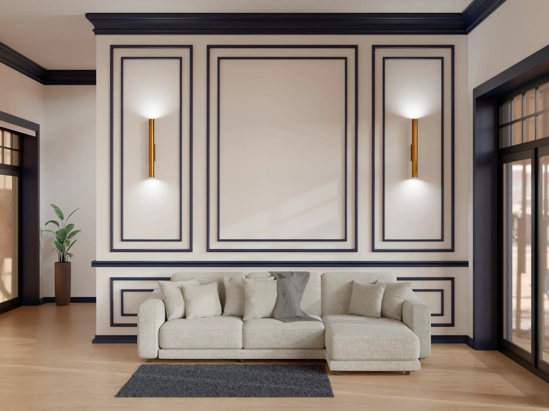
Painting wainscoting with two distinct colors—one for the paneling and one for the wall above—transforms a room, turning a simple accent into a sophisticated design statement. This technique requires careful color planning and precise execution to ensure the dividing line remains crisp and professional.
Why Two-Tone Wainscoting Is Trending
The two-tone approach is more popular than ever because it allows for a highly customized and tailored look that adapts to various ceiling heights and room sizes.
Adds Depth and Visual Interest
- Creates a Horizon Line: By using a different color on the lower wall (wainscoting) than the upper wall, you create a visual horizon line. This subtle break in color prevents large, monochromatic walls from feeling flat or sterile.
- Influences Perceived Height: Generally, placing a darker color on the bottom and a lighter color on the top can make ceilings feel taller, as the eye is drawn upwards to the brighter shade. Conversely, if you use a light wainscoting and a very dark upper color, the room can feel more intimate and enveloping, which is ideal for formal dining rooms or libraries.
Great Way to Highlight Architectural Details
Wainscoting comprises several components: the baseboard, the stile and rail framing, and often a prominent chair rail (or cap) along the top. Using two colors allows you to intentionally highlight these three-dimensional elements.
- Accenting the Chair Rail: You can use a third, accent color (often the crisp white trim color) just for the chair rail itself, making it pop and clearly delineating the transition between the two main wall colors.
- Emphasizing Texture: If your wainscoting features raised or recessed panels, the change in color across the horizontal plane accentuates the shadows created by the molding, giving the entire wall a richer, more textural quality.
Choosing Color Combinations
Selecting the right combination depends on the mood you want to create—do you want striking drama or soothing harmony?
Light Top + Dark Bottom for Contrast
This is the most effective and commonly used pairing, often referred to as “grounding” the room.
- The Effect: A dark color (like black, hunter green, or deep slate gray) on the bottom paneling provides a strong visual anchor for the room and the furniture. The light color above (usually white, cream, or pale gray) lifts the ceiling and provides a refreshing balance.
- Best Uses: High-ceilinged rooms, grand foyers, and formal dining areas where you want to create a sense of history and scale.
- Pro Tip: Choose a dark color for the wainscoting that incorporates a subtle undertone matching the wood or metal finishes in the room (e.g., a warm charcoal if you have brass accents, or a cool navy if you have chrome).
Complementary Tones for Harmony
Harmonious pairings use colors that are close together on the color wheel (analogous colors) or shades of the same color (monochrome).
- The Effect: This pairing creates a sophisticated, cohesive look that avoids hard stops or strong contrast. It’s often calming and subtle. For example:
- Wainscoting: Muted Sage Green
- Upper Wall: Pale Willow Green or a Creamy Off-White
- Best Uses: Bedrooms, nurseries, and cozy reading nooks where the atmosphere should be restful and unbroken.
- Using Tonal Depth: Choose the same color chip but go one or two shades deeper for the wainscoting to add subtle dimensionality without visible contrast.
Painting Techniques for a Crisp Finish
The key to professional two-tone wainscoting lies in achieving a razor-sharp line where the colors meet, typically along the chair rail.
Tape the Chair Rail for Clean Lines
Do not attempt to freehand the line where the two colors meet. Use painter’s tape, but use this advanced technique to guarantee a perfect edge:
- Apply Tape: After the lower wainscoting color has fully cured (often $24$ hours), run your painter’s tape along the exact edge of the chair rail where the new, top wall color will begin. Press the tape down firmly.
- The Caulk Seal: This is the secret step. Run a tiny, thin bead of clear, acrylic paintable caulk along the entire edge of the tape that faces the wall. Immediately wipe the excess caulk away with a damp cloth, leaving only a hairline seal between the tape edge and the wall surface.
- Paint: Paint your new color over the tape and the caulk seal. The caulk prevents the paint from bleeding underneath the tape.
- Remove: While the paint is still wet (the most critical step!), slowly pull the tape away at a $45$-degree angle. The result will be a perfectly sealed, professional, bleed-free line.
Apply Lighter Color First, Darker Second
The order in which you paint the two colors matters for touch-ups and efficiency.
- Top Wall (Lighter Color): Paint the entire upper wall first, without worrying about being perfect at the chair rail line, as this color will be covered by the tape when you paint the wainscoting. Apply two coats of the lighter color.
- Tape and Inspect: Once the top wall color is fully cured, tape off the edge (using the caulk seal technique mentioned above) to prepare for the darker wainscoting color.
- Wainscoting (Darker Color): Paint the wainscoting last. Since the wainscoting color is almost always darker, it easily covers any accidental light paint marks that may have occurred near the chair rail, ensuring a deep, rich final look on the paneling.
Design Inspiration
Navy and White, Beige and Sage, Grey and Blush
| Combination | Wainscoting Color (Bottom) | Upper Wall Color (Top) | Best Room Application |
| Classic Nautical | Deep Navy Blue (Semi-Gloss) | Crisp White (Matte) | Foyer, Mudroom, Formal Bathroom |
| Organic Calm | Muted Beige/Taupe (Satin) | Pale Sage Green (Eggshell) | Bedroom, Reading Nook |
| Modern Softness | Warm Gray (Satin) | Dusty Rose or Blush Pink (Matte) | Nursery, Home Office |
| Industrial Chic | Charcoal Black (Semi-Gloss) | Light Silver Gray (Matte) | Dining Room, Library |
Best Combinations for Small vs. Large Rooms
- Small Rooms (e.g., Powder Room, Hallway): Aim for high contrast but low color saturation. For instance, a medium gray wainscoting paired with a bright white upper wall. Keeping the wainscoting finish highly reflective (semi-gloss) will bounce light and make the space feel less claustrophobic, despite the contrast. Avoid dark colors on both top and bottom.
- Large Rooms (e.g., Open-Concept Living/Dining): These rooms can handle the drama of a dark wainscoting paired with a light, warm neutral above. In a large room, you can also successfully use two mid-tone colors (e.g., deep terracotta and medium cream) without the space feeling crowded. High contrast is excellent for defining zones in an open floor plan.
FAQs
Should the top or bottom be darker?
The bottom (wainscoting) is almost always darker. This follows the design principle of grounding the room, where the heavier, darker tones anchor the foundation, and the lighter tones draw the eye up, creating an expansive feeling.
However, a design exception is when the upper wall features a very busy element, like a complex wallpaper or shiplap siding. In this case, a crisp white wainscoting creates a clean, visual break and prevents the busy upper wall from feeling overwhelming.
Can you use gloss paint for both tones?
You can technically use gloss paint on the wainscoting and the chair rail for superior durability and shine.
However, you should avoid using a gloss or semi-gloss finish on the large, flat surfaces of the upper wall. High-gloss paint magnifies every imperfection, scuff, and drywall seam on a standard wall. For the upper wall color, stick to a flat, matte, or eggshell finish, which is far more forgiving of wall texture and defects.
With these creative color ideas and advanced techniques, you are ready to plan your perfect two-tone space. Let me know if you would like me to generate specific paint codes for any of the pairings listed (like the Beige and Sage combination) or if you want to explore how to incorporate a third trim color!