
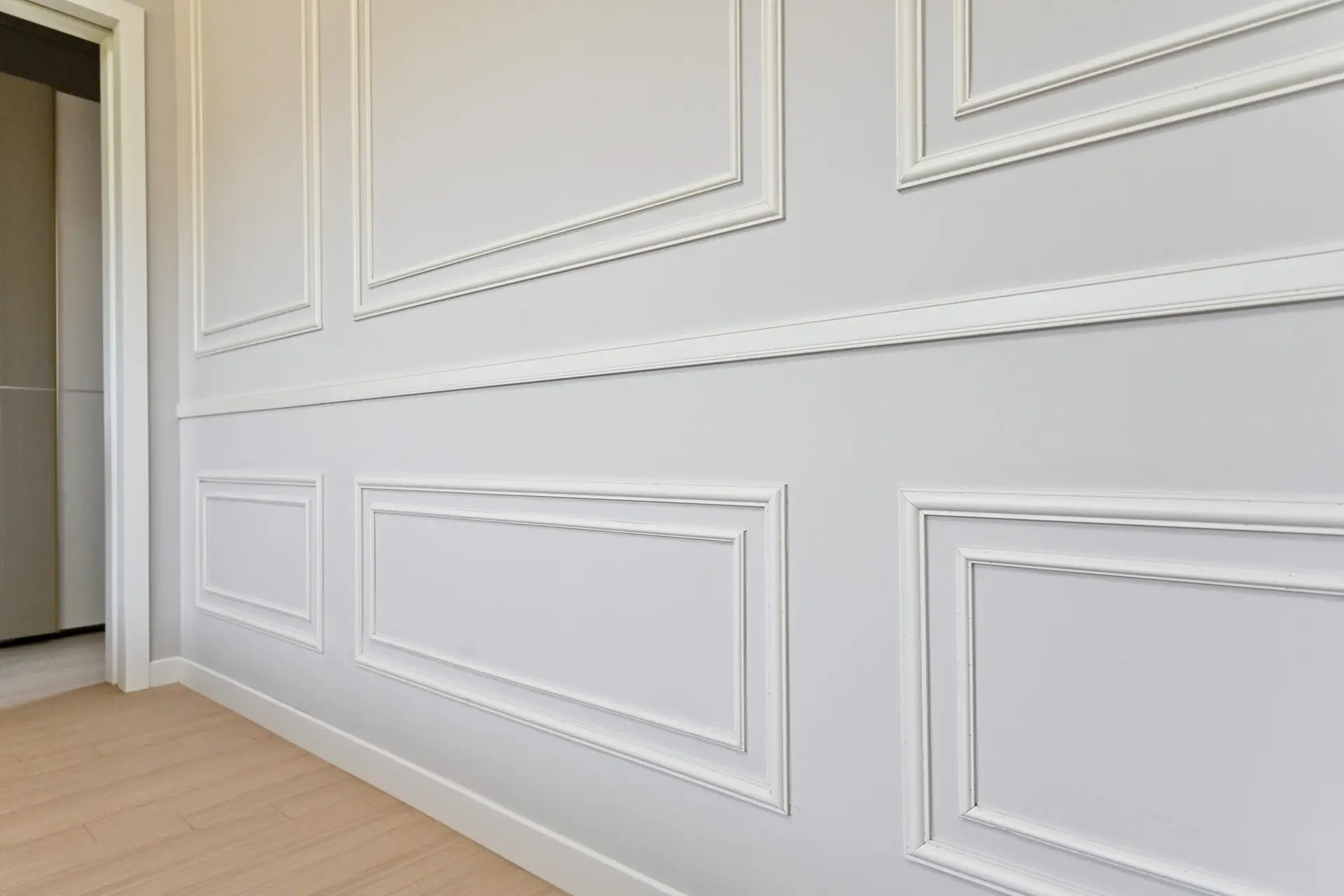
Wainscoting provides a large canvas for color experimentation. Since it typically covers the bottom third of the wall, it grounds the room, creates visual balance, and offers a perfect opportunity to introduce depth or contrast. The key is coordinating the lower color with the upper wall color, the trim, and the furniture.
Most Popular Wainscoting Colors
The choice of color for your wainscoting dictates the overall mood and architectural focus of the space.
Crisp White for Clean, Traditional Looks
- The Go-To Classic: Painting wainscoting a crisp, clean white (like Benjamin Moore’s Chantilly Lace or Sherwin-Williams’ Extra White) remains the most popular choice.
- Visual Effect: White makes the walls above appear brighter and taller, lending a fresh, airy quality to the entire room.
- Application: This choice is essential if you plan to use a bold color, vibrant wallpaper, or complex pattern on the upper wall, as the white wainscoting acts as a clean, neutral break. It works flawlessly in any style of home, from Colonial to modern farmhouse.
Dark Navy or Charcoal for Contrast
- Modern Drama: Using a deep color on the wainscoting is a sophisticated, contemporary trend. Popular choices include deep navy blue, dark forest green, or saturated charcoal gray.
- The Grounding Effect: Dark colors on the lower portion of the wall “anchor” the room, making furniture placement feel more deliberate and substantial. This technique is particularly effective in rooms with high ceilings, as the dark color visually lowers the vertical center, making the room feel more proportionate and intimate.
- Best Placement: High-traffic areas like foyers, hallways, and powder rooms can handle this high-impact, durable look extremely well.
Earthy Tones for Warmth
- Restorative Hues: Colors derived from nature—such as soft sage green, warm taupe, or deep olive—are fantastic for introducing warmth and a cozy, organic feel.
- Sophistication without Drama: Unlike dark navy, these colors offer depth without intense contrast. They pair beautifully with creamy white walls or subtle wallpapers.
- Designer Pick: A warm, muddy greige wainscoting (the perfect mix of gray and beige) is highly versatile, acting as a rich neutral that complements both warm-toned wooden floors and cool-toned metals.
Choosing the Right Color for Each Room
The purpose of the room should heavily influence your color coordination strategy.
Dining Room Elegance vs. Cozy Living Spaces
| Room | Design Goal | Suggested Wainscoting Color | Suggested Upper Wall Color |
| Dining Room | Formal Elegance & Impact | Deep Jewel Tones (e.g., Emerald, Burgundy) | Soft Greige or Taupe |
| Living Room | Cozy, Continuous Flow | Crisp White (Matching Trim) | Light Earthy Neutral or Light Gray |
| Bedroom | Serene, Restful | Muted Sage or Pale Blue | Off-White or Lighter Shade of Wainscoting Color |
| Hallway/Foyer | Durable, Dramatic Welcome | Dark Navy or Charcoal | White or Light Silver Gray |
Matching Wainscoting with Wall and Trim Color
There are three primary schemes for coordinating color:
- The Classic Three-Tone: Wainscoting is painted a crisp white (in a semi-gloss sheen), the trim matches the white, and the upper wall is painted a contrasting color (often a matte finish). This emphasizes the wainscoting as an architectural detail.
- The Monochromatic Flow: Wainscoting and the upper wall are painted the same color, but with different sheens. The upper wall is matte, while the wainscoting is satin/semi-gloss. This creates a subtle, cohesive, and enveloping look.
- The Dramatic Two-Tone: Wainscoting is painted a dark, saturated color (e.g., navy), and the wall above is painted a light, complementary color (e.g., white or pale gray). This creates maximum contrast and visual interest.
Finishes That Enhance Wainscoting
The sheen, or finish, of the paint is critical for durability and aesthetic effect. Because wainscoting is a dimensional detail, you want a finish that highlights its depth.
Satin for Subtle Shine
- The Modern Sheen: Satin has a gentle luster. It offers excellent cleanability and durability without the high-beam reflection that gloss provides.
- Usage: It is often preferred in large, sunlit rooms where excessive gloss might reflect too much glare, and for homeowners who want a slightly more contemporary and restrained appearance than traditional semi-gloss.
Semi-Gloss for Durability and Reflection
- The Traditional Standard: Semi-gloss is the most recommended finish for wainscoting. It offers superior durability, making it easy to wipe down and highly resistant to scuffing—perfect for hallways and dining areas.
- The Detailing Advantage: The high sheen dramatically reflects light, drawing attention to the intricate shadows and lines of the paneling, making the architectural details “pop.”
Trending Design Ideas
Current interior design trends leverage wainscoting for texture and bold color applications.
Monochrome Walls and Trims
A sophisticated technique involves painting the entire room—wainscoting, trim, and upper walls—the same color. The slight variation in paint sheen (as mentioned above) is enough to distinguish the wainscoting detail. For a high-end look, designers often choose a deep neutral like a dark olive or a warm charcoal for this technique, creating a dramatic, immersive color box effect.
Statement Wainscoting with Wallpaper Accents
Instead of white, paint the wainscoting a statement color (e.g., a dusty rose or a vibrant blue). Then, install a large-scale patterned wallpaper above the wainscoting line. The solid-colored wainscoting provides a stable base that prevents the patterned wallpaper from overwhelming the room, allowing you to use bold prints you might otherwise avoid.
FAQs
Should wainscoting be lighter or darker than walls?
There is no fixed rule, but for the best effect, wainscoting should almost always be a different depth than the walls.
- Lighter: Using white wainscoting with a colored wall above is classic and brightens the space.
- Darker: Using a colored wainscoting with a white or lighter colored wall above is modern and grounds the room.
The only rule is to avoid painting both the wainscoting and the wall a near-identical mid-tone color, as this can make the room look flat and undefined.
Can you use matte paint on wainscoting?
It is strongly discouraged. While technically possible, matte paint has a porous finish that absorbs stains and is extremely difficult to clean without the paint rubbing off. Since wainscoting is a high-contact area designed to protect the wall, you need the hard, non-porous surface of a satin or semi-gloss enamel paint for long-term washability and durability.
I’m ready to help you narrow down your choices! Do you have a specific room in mind—like a dining room or a bedroom—where you’d like to try one of these trending color combinations?